UnravelExperiences
A travel brand that sells stays chosen for the experience they create. I led the revamp of the site: experiences told day by day, a member area for Unravel Access, and a loader that unspools the wordmark.
Whatthesitehadtodo.
The original site listed trips the way a catalogue would. Unravel’s pitch is that the stay is the story — sleeping in a jeweller’s home, waking up on a farm. The revamp had to make each experience read like a journey and give members a reason to sign in.
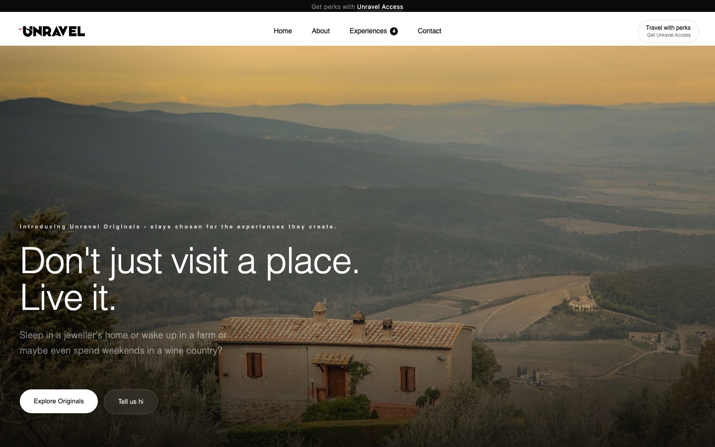
Desktop
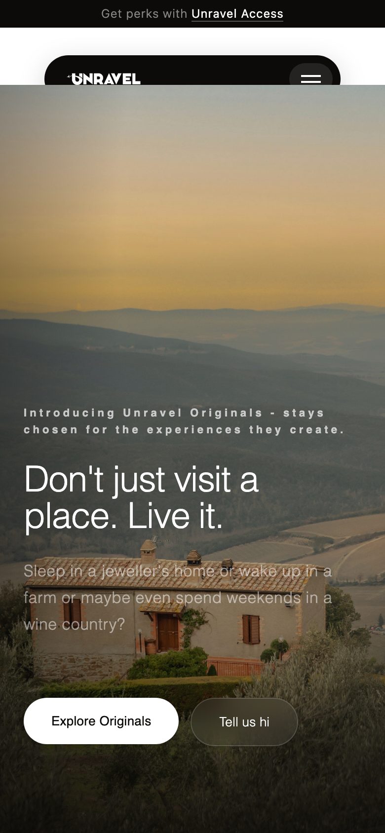
Phone
Howitlooks,andwhy.
- White space and full-bleed landscape photography; ink type, pill-shaped buttons.
- A warm ember-to-saffron accent used only for perks and membership, so it always signals value.
- Experiences composed day by day, with a thread drawn down the page as you scroll through the journey.
- A loader where the “U” rolls in like a spool and lays the wordmark down behind it — the name, animated.
Palette
White
#FFFFFF
Ink
#0A0A0A
Ember
#FF6A1A
Saffron
#FF8A00
Blush
#FFF2E8
Typography
Headlines
Neo-grotesque sans, light weight
Lighter, wider headlines about a third smaller than before — calmer, so the photographs do the selling.
Eyebrows
Widely tracked small caps
Short labels like “Introducing Unravel Originals” set the tone before the headline lands.
Whyeverythingisthewayitis.
Day-by-day experiences
Each trip is laid out as a sequence of days with three photos per row, so a visitor can picture the trip instead of reading a list of inclusions.
Less, calmer type
Section padding cut by about 40% and headlines made lighter and smaller, after the first pass felt like it was shouting.
Unravel Access behind a real login
Membership runs on Supabase Auth with a member dashboard, wallet reveal and member trips, plus an admin panel for the team.
A real map, not a placeholder
The neighbourhood section shows a live Google map of the area rather than a drawn grid, without exposing the street address.
Stack.
Next website
Yercaud Club