AntiLabsStudios
A photo studio, a dance studio and a café under one roof. A pixel-accurate rebuild of their Squarespace site, plus two new pages designed in the same language.
Whatthesitehadtodo.
Anti Labs had a striking Squarespace site for one studio and nothing for the other two. They wanted to own their code, keep the look exactly, and add pages for Anti Motion and Anti Dote that feel like they were always there.
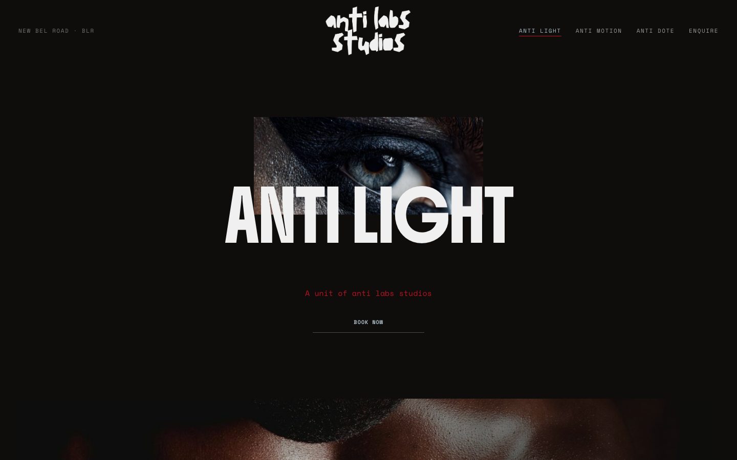
Desktop

Phone
Howitlooks,andwhy.
- Near-black canvas with type and imagery overlapping on a 24-column grid, so words sit inside photographs.
- One accent — a signal red — reserved for the active state and the line under the current page.
- Huge, centred display type punched through by cropped images.
- Navigation in small, spaced mono capitals so it never competes with the headlines.
Palette
Black
#0E0D0C
Bone
#F0F0F0
Signal red
#BB1122
Steel
#ABBCC4
Slate
#404C4F
Typography
Display
Boldonse
Compressed, heavy and loud — it carries the brand on its own. Its tall ascenders need about 1.3 line-height or lines collide, which the original site had already worked out.
Text
Space Mono
Monospace body copy gives the studio a technical, darkroom feel and contrasts with the shouting display face.
UI
Space Grotesk
For navigation and small labels where mono would get cramped.
Whyeverythingisthewayitis.
Measured, not eyeballed
The Squarespace layout engine was reverse-engineered to 24 columns at 45.5px with a 12px gap on desktop and 8 columns on mobile. Every block matches the original to within one pixel, at exact page height, at both sizes.
Original fonts, self-hosted
The same font files the original serves, so the rebuild doesn’t subtly change character.
New pages from the same rules
Anti Motion and Anti Dote reuse the grid, type scale and overlap patterns instead of inventing new ones. Prices are left “on request” rather than made up for a real business.
A navigation the original lacked
The source shipped an empty nav. With four pages, the rebuild adds one that keeps the logo centred and retracts on scroll, just like the original header.
Stack.
Next website
Unravel Experiences